Ceramic artwork by Maggie Doser
-Reviewed by Olivia DuBois
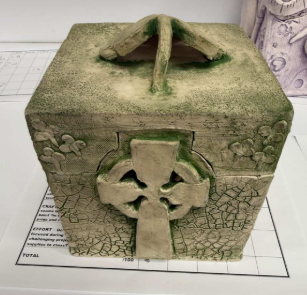
This striking green box immediately caught my eye among the ceramics display in the LWC art show. The first thing I noted was how the large clover on the lid of the box serves as a handle while seamlessly blending into the design of piece. The clover motif can be found throughout the sculpture, a clear nod to Irish culture. However, the large Celtic cross on the front of the box immediately stood out to me as a more thoughtful detail. I’m 50% Irish and have always found the imagery beautiful, so I was urged to reach out to the artist to learn more. Luckily, senior Maggie Doser was eager to share the personal story behind this piece, what inspired her to create it, and the process.
Doser’s ceramics class was instructed to create a square shaped box with a functional lid, lots of texture, and an over-arching theme. She claims that the design came easily to her during the sketching process, stating, “I’m insanely grateful for my Irish heritage and little pieces of it stay with me every day, whether it’s hearing my grandmother’s accent, my mom bringing home treats from the Irish market, or my freckles coming out in the summertime.” The artist divulged her experience as the granddaughter of an Irish immigrant, explaining how pieces of Ireland have always been part of her life and family, as well as her desire to channel that love into her art. Doser describes the process of constructing the box as a learning curve, especially as the end of the semester approached rapidly. However, she spent much of her personal time in the ceramics room, dedicated to bringing her vision to life. A unique crackled effect surrounds the walls of the box, accompanying a stippled pattern on the lid. The different textures work together to give the box a handmade look and a genuine feel. Reflecting on the process, Doser claims that her favorite part was translating the smaller details into clay to bring the piece together. Whether you are admiring it closely or from afar, the thought and effort that went into Doser’s work is undeniable. The construction and composition come together to spread the beauty and depth of Irish culture.
“Everyday Alien” by Emile McAllister
-Reviewed by Abigail Paczesny
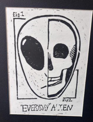
I have never seen myself as an outsider. Not once have I questioned my differences or quirks. The idea of aliens and foreign life forms never scared me and that is why Emile McAllister’s print of an “Everyday” Alien caught my attention. When I first saw it, the large words made me stop because, what could be an everyday alien? The closer I looked, the more it made sense as the inside of the alien is a human skeleton. The black and white makes it feel like an x-ray peering into what makes us human. That simplification is intriguing because it matches my previous thoughts on intergalactic lifeforms. They are no different from us. They too are on a floating rock in space that sustains their life in the same way Earth does for us. This piece stood out to me even without bright colors or large scale, but Emile’s other artworks had those bright colors and others took over the walls because of their size. His complete collection is show-stopping not only for the artwork but the storytelling as well. He uses color as well as black and white to connect each piece to the next while also giving each one their own eye-catching appeal. The specific work, “Everyday” Alien, was a standout to me because it made me feel understood. It was a reminder that every human has their own unusual way of being. While one person may see an action as peculiar, another may join right in. We are all odd in our own ways making us all the aliens that are seen as truly out of this world. I think the title, “One in the same” would fit this work of art perfectly because every human really is the same flesh and bones, and aliens and humans are not too far off from each other when compared.
“I am Human, and I Need to Belong” by Emile McAlister
-Reviewed by Flynn Scanlan
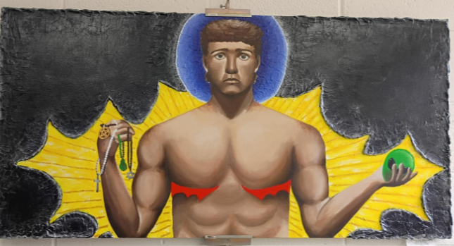
During the art show, there was a rather large, painted canvas with the title I Am Human and I Need to Belong, by Emile McAllister depicting a man with scars on his chest with religious symbols in his right hand and a stereotypical, green alien head in his left.
The eye-catcher for the artwork is the bright, smooth yellow emerging from the rough, black background behind the man. The yellow provides a stark contrast from other hues in the painting while also symbolizing a hope for people identifying as transgender, a strong desire to belong among common society that wishes to be heard.
The next details the eye naturally draws to are the red, spikey details underneath the man’s chest, scars from surgery. Following the anatomy, the eye eventually finds itself at the mans hand, the right holding various tokens and symbols from Christianity or Catholicism, Judaism, Paganism, and Buddhism religions, the left holding a small, green alien head. Circling back, it leads back to the man’s face with a blue halo behind it, his expression solemn.
The above details register as important to viewers not only because of their ability to cause a second glance, but because of their symbolism. The bright, red scars represent the struggles of transgender communities as they seek belonging through different methods. The religious symbols are held close, illustrating a calling to belong in any religion, while the alien head is held farther away, providing a unique argument for transgender people -or anyone who feels different – against alienation. Lastly, the blue halo behind the man’s head could be seen as innocence, showing that the man depicted has done no wrong because of his scars, and that he simply seeks to belong.
Continuing, interesting details about the artwork includes the technique used to create the backdrop. The painter spread the paint thin and smooth for the yellow portion, as one normally would do when painting, but in order to create that stark contrast between hope and loss, the painter used a completely different technique for the black section. They layered the paint on thick and with waves, creating a textural visualization of the conflict between geniality and hostility.
Adding on, the illustration allows for feeling sorrow for the man depicted, as well as a hope that he will finally belong. Even for people who aren’t transgender, the painting expresses struggle and hope, both universal themes that gives anyone the ability to appreciate the work and its message.
Finally, it could be considered that the painting itself could have a wide variety of names. The painting depicts struggle, loss, desire, and a want to belong, granting numerous opportunities for a fitting title that needs to cover all topics. Personally, I think McAllister already has the perfect name for the masterpiece: I Am Human and I Need to Belong.
“California” by Ella Starcevic
-Reviewed by Ryah Hassad
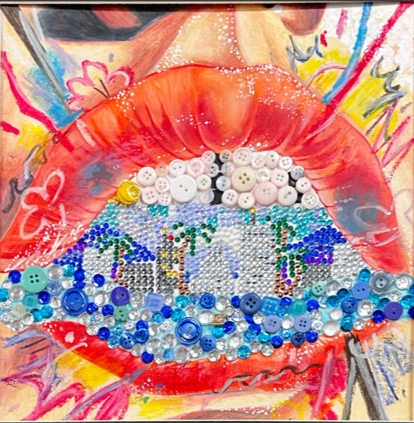
When I first saw this piece, the dazzling gems and buttons immediately captured my attention. The ocean of patterns this work holds stopped me in my tracks. All the art that surrounds it is amazing, but once I noticed “California,” it felt like all the lights had dimmed and a spotlight turned its attention toward it. Looking at it, I could feel a warm breeze blowing my way, tangling my hair, or my toes in the sand that will eventually be washed off by the forgiving ocean. I could taste strawberry ice cream on a hot day, melting down my fingers that I will lick to salvage the refreshment. I could hear pop music playing, the kind that makes you feel that summer is forever. I guess in a way it could be summer forever when you’re in California. The sharp lines and vibrant colors that adorn this art make me feel the noise of California. You never find silence there, in a good way, though. Every sound, color, or line is someone’s life, whether it’s happy like hot pink, easy like a straight line, cruel like a jagged gray line, or calm and smooth like a curved blue line. I do not only see the palm trees or the city of California, with every stroke of intention, I also see the “background” people of it. This represents the taste of California that tourists get, all the emotions a state like that can evoke. However, I also feel it can represent those who are numb to that taste and the different ways California can affect them. Despite how saturated Starcevic’s “California” is, she does a great job of highlighting those that are not saturated as the perception of California is, in my opinion.
Mixed Media Artwork by Aubrey Shipman
-Reviewed by Megan Moy
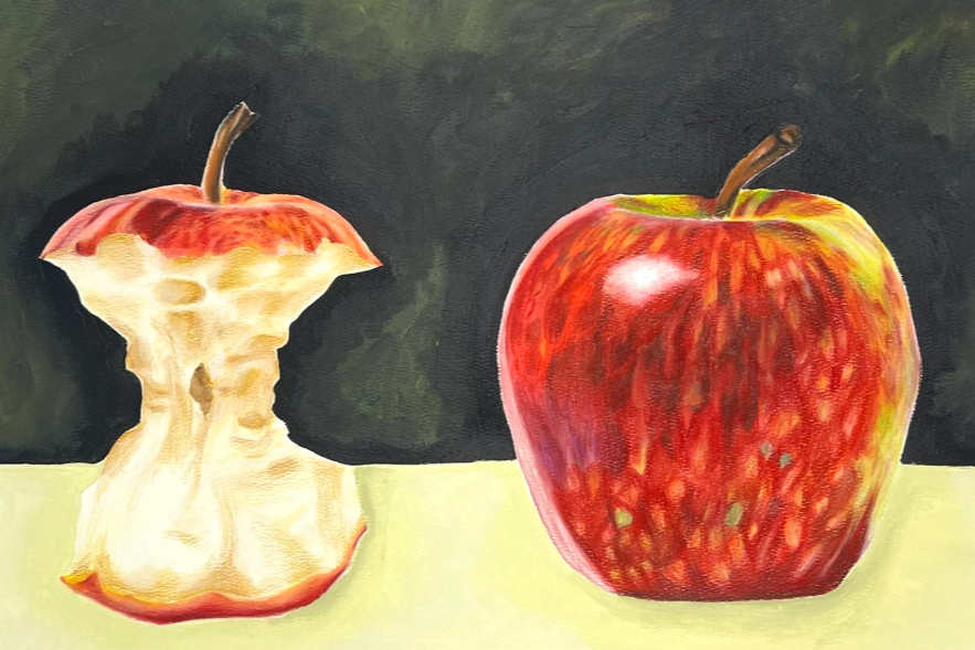
At first glance, the most striking feature of the artwork is the sharp contrast between the two apples: one is a whole apple that is glossy and vibrant, while the other is hollowed out and reduced to a fragile core. This contrast immediately draws attention because it presents clear visual opposition between completeness and reduction. The rich reds and highlights on the apples stand out strongly against the dark background, making it both the focal point and creating an important presence. As I continue to observe the piece, the artist’s attention to detail becomes significant. The shading and textures give both apples a realistic, almost three-dimensional quality to it. The variation in color, especially in the whole apple, demonstrates a strong understanding of light and form. At the same time, the rough and uneven edges of the core emphasize its deterioration, reinforcing the contrast between the two apples. The composition led my eye smoothly from one object to the other. The brightness and fullness of the whole apple initially capture my attention, but my eye is drawn towards the core, creating a sense of progression. This movement suggests a narrative, almost as if you are witnessing a transformation over time. Beyond its technical skill, the artwork invites a deep interpretation for me. The pairing of the two apples can symbolize themes such as change and the passage of time. The intact apple may represent vitality or new beginnings, while the core may represent what remains after something has been used or experienced. This contrast creates a subtle but meaningful message about how objects and possibly people are shaped by time and experience. Overall, the apple creates a reflective tone for me. While realism highlights beauty, the subject introduces a sense of impermanence. Titles that I would give this artwork would be, “What Remains” or “Consumed” because the artist effectively captures the idea of transformation and contrast in the artwork. Overall, the piece is absolutely beautiful, great job Aubrey!
Artwork by Aubrey Shipman
-Reviewed by Allie Sommer
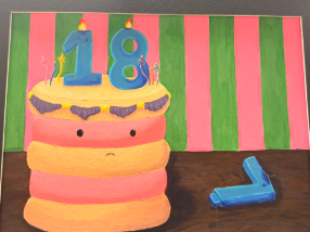
Upon first glance, the viewer is immediately struck by the vibrant contrast of the pink and green striped background. It sets a stage that typically suggests celebration and youthful energy. However, the focal point- a soft, pillowy cake- quickly unsettles the expectations. What stands out most is the cakes minimal yet deeply expressive face; the small, downturned mouth and wide-set eyes show a sense of melancholy which feels out of place for a birthday. The artwork captures the complex “coming of age” anxiety that many teenagers feel. While the colors are playful, the heavy purple frosting and dark shadows on the table add weight to the entire composition. It represents the bittersweet nature of turning eighteen: the world expects a celebration, yet Aubrey might feel a sense of loss for the simplicity of being seventeen. Her work could be titled “Sweet Sorrow,” serving as a reminder that growing up is often a quiet, internal struggle hidden by a bright exterior.
Artwork by Aubrey Shipman
-Reviewed by Katie Petrosky
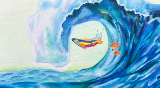
This artistic work really stood out to me. The first thing that caught my eye were the colors, and specifically the multicolor fish at the center of the piece. This is evidently the focal point as the artist uses white space to form a space for this fish and manipulates different colors that were not used in other parts of the piece. However, my eyes were then guided to the orange goldfish trailing behind. Shipman contrasts the cool toned blue of the water with the warm orange of the fish to purposefully guide your eyes in this manner. This helps her to convey the story depicted in this artwork: one of three smaller simple goldfish being inspired and led by the rainbow fish. The goldfish are drawn in a simple way, creating a sense of nostalgia as they remind the viewer of “Goldfish Crackers” from their childhood, with more childish tones than in the other more complex fish. The rainbow fish is beautifully gliding through the water while the goldfish smile happily and follow along. This evokes a scene like children chasing an adult. The art inspires the viewer in this fashion, reminding each one of us that we were once these fish, learning our ways through the big waves, symbolizing life and the simultaneous beauty and risk of each situation. The wave and colors as a whole flow naturally, creating a surreal background that romanticizes the ocean. The sky is colored a subtle greenish tone to not only contrast with the water but also build this dreamlike world. The wave colors and design evoke a similar nostalgia as priorly mentioned, using deep blues, greens, and purples to build a whimsical landscape. For me personally, this artwork feels like childhood and growth. I would title it “Golden Waters” to emphasize the goldfish, fond memories and emotions, and symbolism of the ocean within the art. Truly, this piece showcases a deep amount of talent and profound thought, and Shipman should be greatly proud of her work.
“Weiner Dog of Chicago” by Aubrey Shipman
-Nicole Demma
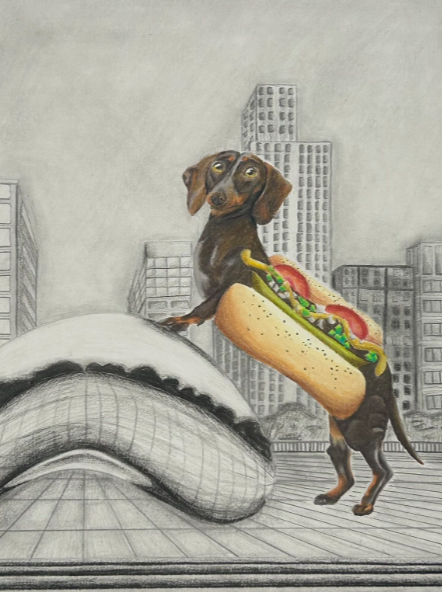
Artist Aubrey Shipman does a phenomenal job at displaying her niche personality in her artwork, as her artwork stands out to readers because of the funny references and pleasing design. Across a series of pieces, it’s common to see the main focal point more colorful than the background, her piece the “Weiner Dog of Chicago” is a prime example. The fine details of the dog, combined with a classic Chicago hotdog is immediately identified as the main theme of her piece because of the rich colors contrasting the black and white sketched background. However, just because the Chicago skyline is sketched in pencil doesn’t mean it’s not as pleasant to the eye, as it is obvious Shipman put in time to carefully and mindfully portray the beauty of the city and its popular sculpture Cloud Gate. The artwork resembles the city’s culture and world-known traits, from the picture-perfect skyline to the art displays, and finally the culture is all tied together with a daschund standing over “the bean,” symbolizing Chicago’s dominant presence and history, with the touch of a vivid hotdog adding humor and even more cultural significance. If I saw this piece in any building throughout the city, I wouldn’t be surprised. The colorful sketch of the classic dog, combined with the highlighted architecture display of the city, builds on the representation of Chicago culture and pride. Furthermore, there can be irony found in the dog prevailing over “the bean,” implying a stance of supremacy, all while overlooking the crowd with its soft eyes. This contrast leaves the audience stuck between viewing in awe to the hotdog or viewing it under authoritative behavior. On the other hand, the unserious character of the artist leaves viewers a sense of amusement and jocularity, as the simple irony is the unrealistic dog dressed up as a classic Chicago hotdog.
Artwork by Caitlyn Lim
-Reviewed by Gavin Hoff
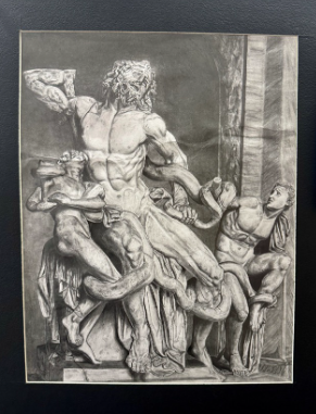
As I walk around the art show, I am enamored by all of the colors, shapes, and sculptures around me. Yet, one of the pictures did not even include color, this painting did not need color to compel the story displayed in front of me. What stood out to me the most was the clean and accurate depiction of the sculptures. Its sculpture captures the intense and dramatic emotions from this drawing and its various shades of graphite.
As I kept looking, the detailed shading and careful attention to the physiology of these sculptures became more noticeable. From the agony in the eyes, to fear this drawing captures the realistic and emotional scene. The shading captures an unreal depth to the drawing.
My eyes jump around from one place to another to absorb all of its realistic depth and lighting. Its servants look at certain points in the drawing which leads me to looking in that direction.
What interests me the most is the depth of drawing that goes into the physiology of these drawings. The history of innovation is unforeseen. From the serpent to the figures, what can interest anyone is the strained expression and conveyed struggle on the paper. I end up asking myself: how can one portray so much with just graphite and paper?
I imagine myself in such shoes of those sculptures entangled in emotion and fear. The painting seems to represent power and power and fear itself. The painting guides the reader through divided emotions.
If I were to give this artwork any title, I would give it the title of “The Emotion Within” due to the emotion and symbolic features such as the serpent and figures.
From the artist, Caitlyn Lim:
Laocoön and His Sons stunned me the moment I saw the statue. I was drawn to the immense details and craftsmanship that carved these emotions of distress, despair, and fear. I watched as the raging, winding serpents blended into the twisted bodies of the three figures. The scene was in my phone and my mind until the next year when I unsurfaced it for my Drawing and Painting assignment.
Every day working on it, I’d look at the picture and wonder who these people were. Why were there serpents? Where did the statue come from? With help from my teachers, I was enlightened about the story behind Laocoön and His Sons. It began with Laocoön, a priest who warned against the Trojan House during the Trojan War. Angered by his interference, Poseidon sent his serpents to kill Laocoön and his sons. The statue was buried for hundreds of years after the fall of Rome and was rediscovered during the Italian Renaissance.
While working on it, I began to notice details in the statue which I incorporated to add to the realism of my work: the large crack around Laocoön’s left shoulder indicating his arm was reattached, the intricately small veins tracing along the legs and feet, the intense eyes in the three faces conveying the deepest feelings of anguish. I began to live the art and emotions. I was witnessing and recreating a tragedy, a story that explored the universal themes of human fate and suffering (which I felt after months of working on it, wondering why I chose such a detailed picture).
Now when I look at my drawing, I feel a great sense of accomplishment and gratefulness that I got to share the same story and statue that mystified me at the Lincoln-Way Central Art Show. I am proud that our community continues to appreciate the dedication and importance of the arts.
Artwork by Megan Moy
-Reviewed by Elizabeth Taussig

Tomatoes are seemingly ordinary vegetables. However, Megan Moy captures a magical and artistic essence in her strikingly realistic depiction of two beautiful tomatoes. This award-winning work of art possesses both impressive highlights and shadows that bring out the intricacies of the subject, guiding the eyes of the viewer throughout the drawing. One of the most notable aspects of this creation is the clever use of contrast. In addition to the distinction between light and dark, viewers can observe the textural contrast between the rough interior and the smooth exterior of the tomatoes. Similarly, Megan’s decision to include a blue background creates an eye-catching harmony between the two primary colors. It is Megan’s use of subtle details that contributes to her work’s next-level realism.
In short, this piece does not merely depict a common vegetable but creates an artistic experience that cannot easily be put into words. Fortunately, Megan’s art, as the recipient of the prestigious “Purchase Award,” will be displayed in the LWC Fine Arts Lobby for years to come, sharing the feeling of joy and wonder that I experienced in my encounter with this masterpiece.
Necklace by Caroline Howey
-Reviewed by: Lauren Rogers
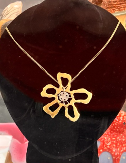
Normally I view jewelry as a way to compliment an outfit; it brings out the aspects you wish to highlight or conceal. I will be the first to admit that I was wrong. I realized that jewelry can send a message about who you are, who you wish to be, goals you fight for, and what you support. At the LWC art fair, senior Caroline Howey’s jewelry piece spoke to who I wish I could be. At first glance, I saw a gold abstract flower, what dragged my eye back every time was the large, mixed chrome, organic shape amidst the smaller symmetrical pieces. It truly is one of a kind. Caroline Howey’s piece is refreshing to see in a “perfect” world. With AI filters, plastic surgery, influencers, and a college system that requires you to be the perfect student to get excepted, the one of a kind slower rejects my worst fear that I am not enough. As my eyes followed the ripples in the petals, the rings connecting the center, and the contrast between the gold and silver metals, I noticed that what some people deem “mistakes” are actually traits that draws the eyes of people that pass. It was the seemingly imperfect piece that made me relieve that stress, anxiety, and pressure to be perfect turned me into an insecure, overthought, and burnt-out person. Howey’s piece showed me that I am perfect the way I am. That nobody needs to change to fit into society’s standards. That is why I’m calling this piece “Perfect as is.”